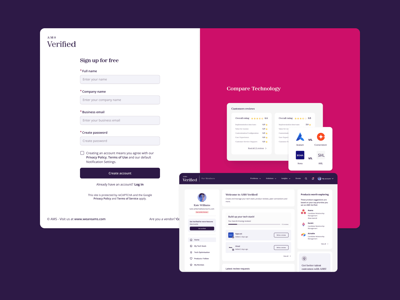
Context
At the time, 32% of member accounts were active and the business wanted to increase this to 34%. The team was also seeing support issues around account creation and activation.
But redesigning the registration form alone would not tell us why people were dropping out. The first question was simpler: Where are we losing people, and what is causing them to stop?
Problem
The existing journey had a fragile point immediately after registration. Users created an account, received an activation email, activated or not it and then returned to log in. If someone missed the email, forgot about it or left the journey, there was very little helping them understand how to continue.
The problem was not only the form. It was the journey around it.
Research
Direct access to users was limited at this stage, so I combined the evidence we did have. I worked with the Product Owner and Marketing Lead to understand the issues they were already seeing, used Google Analytics and Microsoft Clarity to look at behaviour, and mapped the complete sign-up and activation journey. Three problems became clear:
• Too much information before value: Registration asked for more information than people needed to provide before experiencing the product.
• Activation was too fragile: The journey depended heavily on a single email, with no clear recovery path or a reminder. • People were entering in different ways: Some people registered themselves. Others were invited by AMS, sometimes with information about them already available. One fixed journey did not work equally well for all three situations.
Approach
I ran a working session with the team to turn those findings into product decisions. We deliberately kept the scope contained rather than using the project to redesign the entire account experience. Three changes mattered most: • Ask for less upfront: Reduce what people need to provide before creating an account.
• Make activation recoverable: Give users a clear way to continue if they do not complete activation the first time. • Support different entry points: Adapt the beginning of the journey depending on how the person arrived, while keeping the main experience consistent.
We identified three entry points: • Self-initiated — where the person chooses to register • Invited — known, where AMS already has information about them • Invited — unknown, where AMS initiates the invitation but more information is still needed.
Testing
Once the journeys were mapped, I turned them into prototypes that we could test. We ran five remote moderated sessions of around 30 minutes, focused on the main journey: sign up, activate the account, log in.
We looked at whether participants understood what to do and could complete the journey.
Activation then had to survive the gap between leaving the site and coming back to it.
All five participants completed the main flow without major usability problems. We found smaller issues to improve, but nothing that required us to rethink the overall direction.
This work also helped research become a more regular part of product decisions. I started using simple testing scripts and prototypes around real product questions, and later worked alongside two client researchers as the practice grew.
Solution
The redesigned experience reduced what people had to provide before account creation and gave activation a clearer recovery path.
Different entry situations could adapt where necessary without turning into completely different experiences.
Impact
The simplified registration experience shipped in March. The following month, AMS Verified recorded 1,673 new users, up 66.6% on March, and 975 returning users, up 36.9% on March.
These were positive post-release signals, but I would not claim that the redesign alone caused the increase. Other activity may also have contributed, and these measures were different from the original activation - rate target.
Together with the usability testing, they gave us useful evidence that the experience was moving in the right direction.
The project reinforced something I have carried into other work: research does not need to be large to be useful. It needs to give the team enough evidence to make a better decision.